
There’s any number of things you can do at this point. It’s really up to your imagination and what you know how to do.
The fact that you have layers and paths at your disposal is going to be very powerful at this point. When you’re applying filters or extra layer effects, you can use the Path to Selection and Add/Subtract/Intersect features on Paths to mask your work to just certain areas.
But, let’s look at some of the specific effects that were added to the Maitre d’.
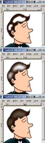
Highlighting on the Maitre d’ is subtle, but makes the finish product look less flat than our original vector image.
To create highlighting like this, start out by creating a new layer for your highlight. Place this above any layers you want the highlight to actually effect. Change the Mode for this layer to “Screen.” Make sure you have this layer selected.
Next, go to your Paths tab and use the Path to Select and Add/Subtract/Intersect features to select the area you actually want your highlight to apply to. This creates a nice mask, so we don’t have to worry about our highlight bleeding into other areas.
Once we have the selection that we’re going to use as our mask, switch to the pen or paintbrush tool. Select a brush size that fits the amount of highlighting you want to add; a fuzzy-edged brush will be useful here as well. (Don’t choose a brush that’s too large, as we’re going to be blurring our highlight before we’re done, which will expand its coverage)
Generally, you will want to use plain white for highlighting. It may be too white at first, but we can always decrease the opacity of our highlight layer so that it blends in nicely. However, if you find that white isn’t creating the particular look you’re wanting, your best bet is usually to start with the base fill color of the area and adjust it to be brighter.
Once you have your brush and color selected, draw the highlighting onto your image. The selection we put in place will mask the pen to just the area we want highlighted, so don’t worry about coloring outside the lines.
Then, with your selection still in place, apply a Gaussian Blur filter to your highlight layer. (You will find this filter under Filters > Blur > Gaussian Blur.) You’ll want to play around with the radius a bit here when you first start so you can figure out what feels right for your image.
Larger blur radii will give you a softer and subtler feel, while smaller ones will be brighter and harder-edged. Generally, for the 300 x 390 pixel Maitre d’ image, I found that a blur of 5-10 pixels was sufficient. For the harder-edged highlights, such as the chainsaw teeth, I used a smaller number like 3 pixels. For the shine on the shoes, I used a larger number like 10 pixels.
When you’re done, you may need to adjust the opacity of the layer down. This will help the highlight blend in with the base fill color.
Shadows work about the same way as highlights. Rather than creating a layer with a “Screen” mode, however, we want to use the “Multiply” mode.
You’ll also want to use black as your starting color rather than white. Either that, or start with your base fill color, and adjust it to be darker (skin tones are a case where this looks better).
The Chef convinced me that the Maitre d’s chainsaw should be a Kraftsman (dude, with a “K!”), so… we needed to add the name. Text is pretty easy to add in either Inkscape or GIMP, but you’ll generally want to do this in GIMP.
In the case of the chainsaw’s brand name, we needed to adjust it so it fit with the perspective of the blade. (Yes, the blade is supposed to be pointing toward the viewer, hence its odd proportions. I’m just not really good at perspective.)
To do this, I created a text layer, and fixed the font and color to look right. Then (so that I could save a copy of the original text layer), I duplicated this layer. I right-clicked on the layer and selected “Discard Text Information.” This renders the text layer to a normal layer that can be modified with GIMP’s filters and tools. Using GIMP’s perspective tool, I then adjusted the name to fit on the chainsaw blade.
In addition to the name of the chainsaw, we needed it to have a vaguely metallic look. Fortunately, GIMP has several pre-set gradients, so you don’t have to try and recreate this effect. To do this, simply select the gradient tool and switch over to the Tool Options dialog box. Click on the gradient, and you’ll get a list of pre-set gradients. The pre-set I used was “Metallic Gradient” (imagine that).
Creating a gradient fill is not so much different from creating a flat color fill. You select the area you want to fill, choose a gradient, and then drag the gradient across the area.